Who is this for?
This tutorial is for Javascript developers who want to create beautiful charts but don’t want to manually pick the chart's colors.
What do I need before I start?
You will need a basic understanding of HTML, CSS, and Javascript. Some data visualization knowledge can help.
What will I learn?
You will learn to create functions that, given an array of data points, will automatically create an array of colors. This technique can be used for a series of charts, including pie charts, bar charts, etc.
You can find all of the code posted here at:
https://github.com/code-nebula/chart-color-generator
In this tutorial, we'll be showing you how to use Chart.js and D3's color scales to create a series of pie charts whose colors are computed automatically.
Generating colors automatically can be tremendously useful for the following cases:
You might have
- A ton of data points — Manually selecting colors for this data can be an absolute pain. (Think of a pie chart with 12 colors)
- Data that is subject to change — Imagine hardcoding 6 color values because your dataset has 6 data points. Now an additional data point is introduced, and you have 7 data points. You'll have to manually add a color for the new data point.
- A desire to distribute your colors in a "visually equidistant" manner — This palette generator site explains that "visually equidistant" values tend to have different base hues. Often times, you'll find yourself using a completely different set of colors depending on the number of data points you have. If you don't know how to create those values, you typically go on a generator site like the one mentioned and copy the values into your code.
Or, like me, you just suck at color theory (what, red, green, and purple don't go together?)
So I ended up being affected by all the cases above. I made the mistake of hardcoding 6 different color code sets depending on the length of the data (from 1-8 data points). My chart obviously broke down when there was more data. What's worse was that I had so much config and conditional code just for this color data!
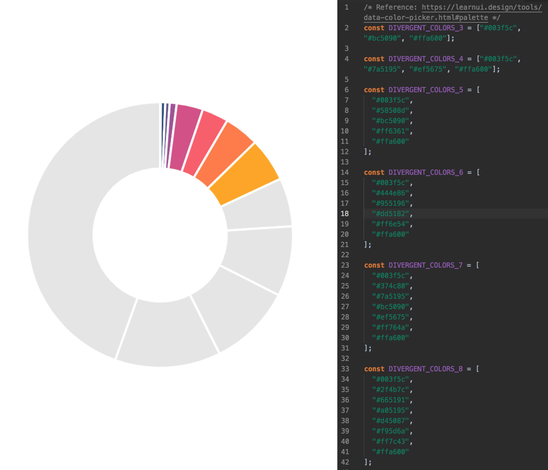 Don't make the mistakes I made!
You might be thinking, well, what about gradients? There is this wonderful tutorial on setting up gradients with Chart.js, but you still need to choose some colors.
What if you never needed to manually pick another hex code for your charts?
Let's dive in.
1. Set Up Your Workspace
Open up your favorite text editor, and set up your workspace to follow a similar format:
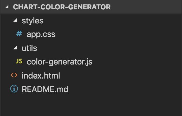
Here's an explanation of the important directories and files:
- index.html (Where we will write HTML and JS code to create our chart)
- utils (For helper functions, like color generating functions)
- styles (For CSS files)
index.html
Because we are writing everything in vanilla, client-side Javascript, we will import the relevant packages via a content delivery network.
First, we will be importing the Chart.js library. Chart.js is an open-source Javascript charting library that uses HTML5 Canvas.
<script src="https://cdn.jsdelivr.net/npm/chart.js@2.8.0/dist/Chart.min.js"></script>
If you're using NPM, you can install it via
npm install chart.js
Next, we will import D3's Scale Chromatic Library. This library features a wonderful, diverse set of color scales.
<script src="https://d3js.org/d3-color.v1.min.js"></script>
<script src="https://d3js.org/d3-interpolate.v1.min.js"></script>
<script src="https://d3js.org/d3-scale-chromatic.v1.min.js"></script>
If you're using NPM, you can install it via
npm install d3-scale-chromatic
Next, we set up our HTML and import a file called color-generator.js which lives in our utils directory.
Lastly, we set up another <script></script> tag. This is where we'll place our chart configuration code.
<script src="https://cdn.jsdelivr.net/npm/chart.js@2.8.0/dist/Chart.min.js"></script>
<script src="https://d3js.org/d3-color.v1.min.js"></script>
<script src="https://d3js.org/d3-interpolate.v1.min.js"></script>
<script src="https://d3js.org/d3-scale-chromatic.v1.min.js"></script>
<script src="utils/color-generator.js">
</script>
<script></script>
styles/app.css
Here we place all of our styling code. You'll see how certain elements, like .chart-container and #pie-chart are styled once we add them to our index.html file later.
      body {
        -webkit-font-smoothing: antialiased;
        -moz-osx-font-smoothing: grayscale;
        font-family: Helvetica, Arial, sans-serif;
      }

      body > * {
        box-sizing: border-box;
      }

      .app-container {
        display: flex;
        justify-content: center;
        padding: 48px 16px 16px 16px;
      }

      .chart-container {
        width: 600px;
      }

      #pie-chart {
        width: 100%;
      }
2. Create Color Generating Functions
First, we'll need to introduce the concept of interpolation. D3's Interpolate library is a good reference to learn more if you're interested.
Interpolation is essentially when you map a value in the domain [0, 1] to a value in a specific range.
In this case, our range will be a set of color codes:
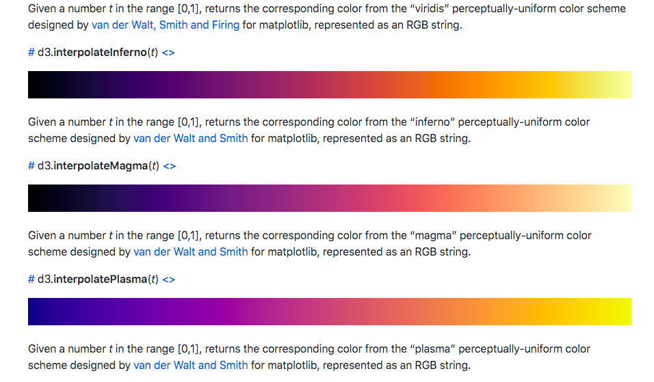 Some D3 Color Scales
While D3's Scale Chromatic library provides many color scales, we will only be using their interpolate color scales (they're the ones that start with "d3.interpolate..."). All of the interpolate color scales have a domain of [0, 1]. So what happens if you choose a number in this domain? If you choose 0.2, you will receive a color that falls at the 0.2 mark on the scale.
Here's an image to clarify:
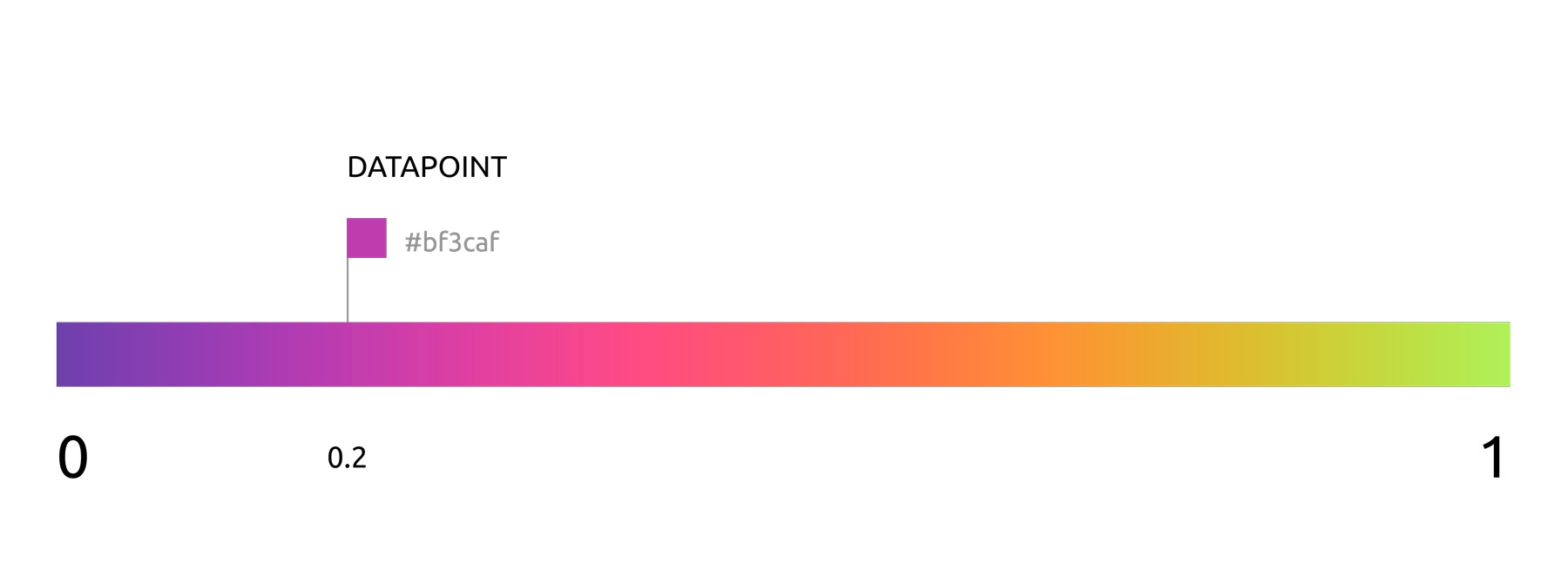 Interpolation using D3's "d3.interpolateWarm" scale
To interpolate a color based on our data set, we'll need to first map our data set to the color scale range, [0, 1].
We do this by breaking down our dataset into intervals of length 1.
EXAMPLE #1
Say we had a dataset of length 4. We'd need to map our dataset range, [0, 4], to the color scale's range, [0, 1].
Data related information
dataLength = 4;
Color related information
colorStart = 0;
colorEnd = 1;
colorRange = 1;
We need to find the size of the color scale's interval.
Our dataset intervals look like:
(0, 1), (1, 2), (2, 3), (3, 4)
The corresponding color intervals will look like:
(0, 1/4), (1/4, 2/4), (2/4, 3/4), (3/4, 1) or (0, 0.25), (0.25, 0.5), (0.5, 0.75), (0.75, 1)
We're dividing the color scale's range length, 1, by the dataset's range length.
![4 datapoints with color range [0, 1]](https://s3.amazonaws.com/stripemadeeasy/chart-color-generator%3A0-1-4datapoints.jpg) 4 datapoints with color range [0, 1] (using "d3.interpolateWarm" scale)
4 datapoints with color range [0, 1] (using "d3.interpolateWarm" scale)
Now let's try a more complicated example.
EXAMPLE #2
Data related information
dataLength = 4;
Color related information
colorStart: 0.25;
colorEnd: 0.75;
colorRange = 0.5;
We want to map our dataset range, [0, 4], to the color scale's range, [0.25, 0.75].
Dataset intervals: (0, 1), (1, 2), (2, 3), (3, 4) -> Color Intervals: ?
First we find the colorRange, which is 0.75 - 0.25 = 0.5.
Notice that the intervalSize is colorRange / dataLength, so it is 0.5/4, or 0.125.
Our scale starts at 0.25, so that's our starting number (colorStart).
Taking these two concepts into account, let's build our color intervals:
(0.25, (0.25 + (0 * 0.125))),
(0.25, (0.25 + (1 * 0.125))),
(0.25, (0.25 + (2 * 0.125))),
(0.25, (0.25 + (3 * 0.125)))
or
(0.25, 0.375),
(0.375, 0.5),
(0.5, 0.625),
(0.625, 0.75)
![4 datapoints with color range [0.25, 0.75]](https://s3.amazonaws.com/stripemadeeasy/chart-color-generator%3A2575-4datapoints.jpg) 4 datapoints with color range [0.25, 0.75] (using "d3.interpolateWarm" scale)
4 datapoints with color range [0.25, 0.75] (using "d3.interpolateWarm" scale)
Our equation, as we move up the scale, becomes
colorStart + (i * intervalSize)
...where i represents the index of the data point.
Note that we use the beginning of the interval as our color value. If you wanted to use the end of each interval, your equation would be
colorStart + ((i + 1) * intervalSize)
If we want to use the end of the scale as the start, we would move down the scale:
colorEnd - (i * intervalSize)
Taking these ideas into account, we can create a function to calculate a point in the range [0, 1] based on our dataset's length. Remember
intervalSize = colorRange / dataLength
utils/color-generator.js
        function calculatePoint(i, intervalSize, colorRangeInfo) {
          var { colorStart, colorEnd, useEndAsStart } = colorRangeInfo;
          return (useEndAsStart
            ? (colorEnd - (i * intervalSize))
            : (colorStart + (i * intervalSize)));
        }
Now that we understand how the colors are calculated, we can create an array of colors based on our data's length (the number of data points).
        /* Must use an interpolated color scale, which has a range of [0, 1] */
        function interpolateColors(dataLength, colorScale, colorRangeInfo) {
          var { colorStart, colorEnd } = colorRangeInfo;
          var colorRange = colorEnd - colorStart;
          var intervalSize = colorRange / dataLength;
          var i, colorPoint;
          var colorArray = [];

          for (i = 0; i < dataLength; i++) {
            colorPoint = calculatePoint(i, intervalSize, colorRangeInfo);
            colorArray.push(colorScale(colorPoint));
          }

          return colorArray;
        }
3. Create Your Chart
Now that we've got our color functions, we'll focus on creating our chart.
We'll be creating a pie (or "doughnut" to be more accurate) chart for this tutorial. However, you can still apply these concepts across other charts (bar charts, etc.)
We'll create the chart in the "index.html" file because the necessary libraries will be imported there. I could place the libraries on the window (window.Chart = Chart), but I don't want to go down that route. Just know that in a non-demo case, you'd likely want to place the following code snippets in a separate Javascript file.
HTML Section — index.html
In the body of the HTML portion of index.html, we'll add a container for styling. Note that we'll be mounting our pie chart to a "canvas" element. So let's create that element and give an "id" attribute so we can later easily reference it.
Javascript Section — index.html
First, we'll set up our createChart function that take in an id, the chart data, the requested D3 interpolate color scale, and our color range information.
function createChart(chartId, chartData, colorScale, colorRangeInfo)
- chartId: String
- chartData: { data: Array, labels: Array }
- colorScale: Function (D3 interpolate color scale)
- colorRangeInfo: { colorStart: Number, colorEnd: Number, useEndAsStart: Boolean }
We'll then grab our canvas element by using the inputted id. Then we'll calculate the data's length and pass it to our interpolateColors function. (Remember that we have access to these functions because we imported the color-generator.js file).
We configure our charts according to Chart.js' documentation. We specify the type of the chart, pass in the labels, pass in colors for the pie chart segments and segments on hover, and the chart data.
Then we choose to make the chart responsive, specify that we don't want a legend, and set the cursor to have the "pointer" style on hover.
      /* Set up Chart.js Pie Chart */
      function createChart(chartId, chartData, colorScale, colorRangeInfo) {
        /* Grab chart element by id */
        const chartElement = document.getElementById(chartId);

        const dataLength = chartData.data.length;

        /* Create color array */
        var COLORS = interpolateColors(dataLength, colorScale, colorRangeInfo);


        /* Create chart */
        const myChart = new Chart(chartElement, {
          type: 'doughnut',
          data: {
            labels: chartData.labels,
            datasets: [
              {
                backgroundColor: COLORS,
                hoverBackgroundColor: COLORS,
                data: chartData.data
              }
            ],
          },
          options: {
            responsive: true,
            legend: {
              display: false,
            },
            hover: {
              onHover: function(e) {
                var point = this.getElementAtEvent(e);
                e.target.style.cursor = point.length ? 'pointer' : 'default';
              },
            },
          }
        });

        return myChart;
      }
Next, we create a random number generator with min and max values to act as the range. We use this function to create dummy data.
      function getRandomNumber(min, max) {
        return Math.round(Math.random() * (max - min) + min);
      }
Now it's time for us to set up our example parameters and pass them into our createChart function.
I create an array of length 10, and for each data point, I generate a random number within the range [20, 110]. I generate labels that take the form "Label i", where i is the index.
I set the colorScale as d3.interpolateInferno. Lastly I specify the colorRangeInfo where I set the start and end of the interval (both values must be within 0 and 1) and choose if I want to use the end of the color scale as my starting point.
      /* Example Data */
      const arrayLength = 10;
      const min = 20;
      const max = 110;

      var i;
      var data = [];
      var labels = [];

      for (i = 0; i < arrayLength; i++) {
        data.push(getRandomNumber(min, max));
        labels.push(`Label ${i + 1}`);
      }

      const chartData = {
        labels: labels,
        data: data,
      };

      const colorScale = d3.interpolateInferno;

      const colorRangeInfo = {
        colorStart: 0,
        colorEnd: 1,
        useEndAsStart: false,
      };
Lastly, call your createChart function with the example parameters.
    /* Create Chart */
    createChart('pie-chart', chartData, colorScale, colorRangeInfo);
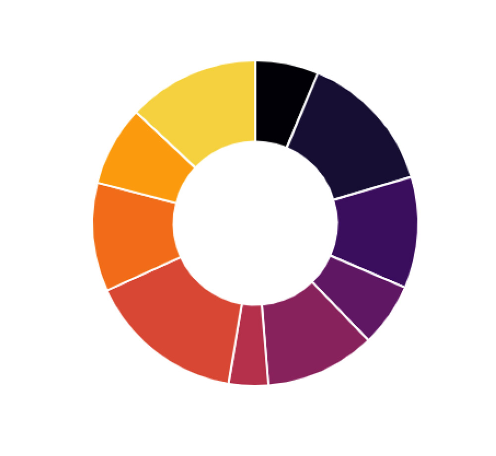
If you open your index.html in your browser, you should see the following:
4. Mess Around With the Parameters (colorStart, colorEnd, useEndAsStart)
We can mess around with the parameters mentioned above to produce various charts.
Changing the Color Range
In the previous example, I think the starting color is too dark. Let's change the start value so that the colorRangeInfo object looks like
      const colorRangeInfo = {
        colorStart: 0.2,
        colorEnd: 1,
        useEndAsStart: false,
      }
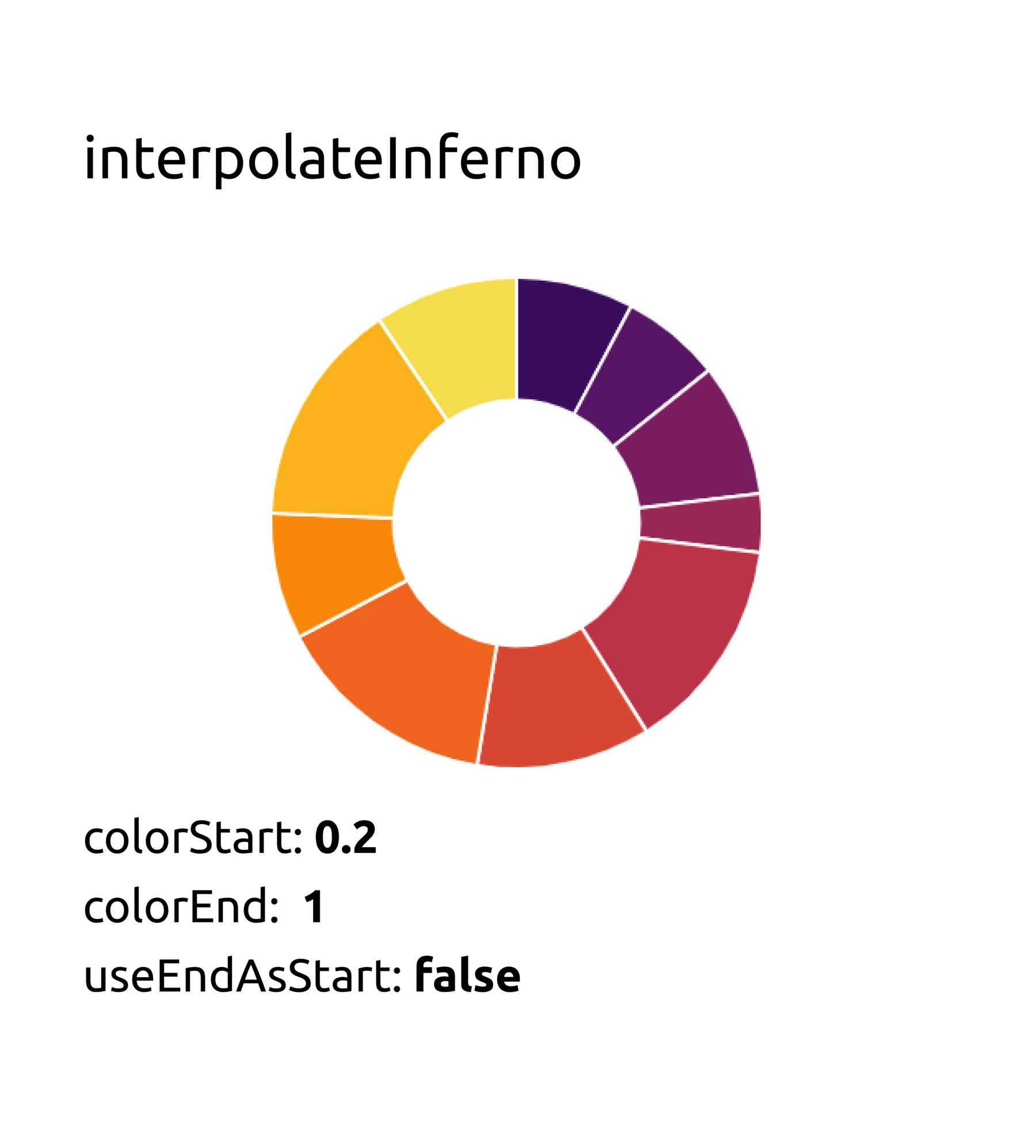 Changing the "colorStart" parameter
Using the End of the Scale as the Start
Change the colorRangeInfo object to look like
      const colorRangeInfo = {
        colorStart: 0.2,
        colorEnd: 1,
        useEndAsStart: true,
      }
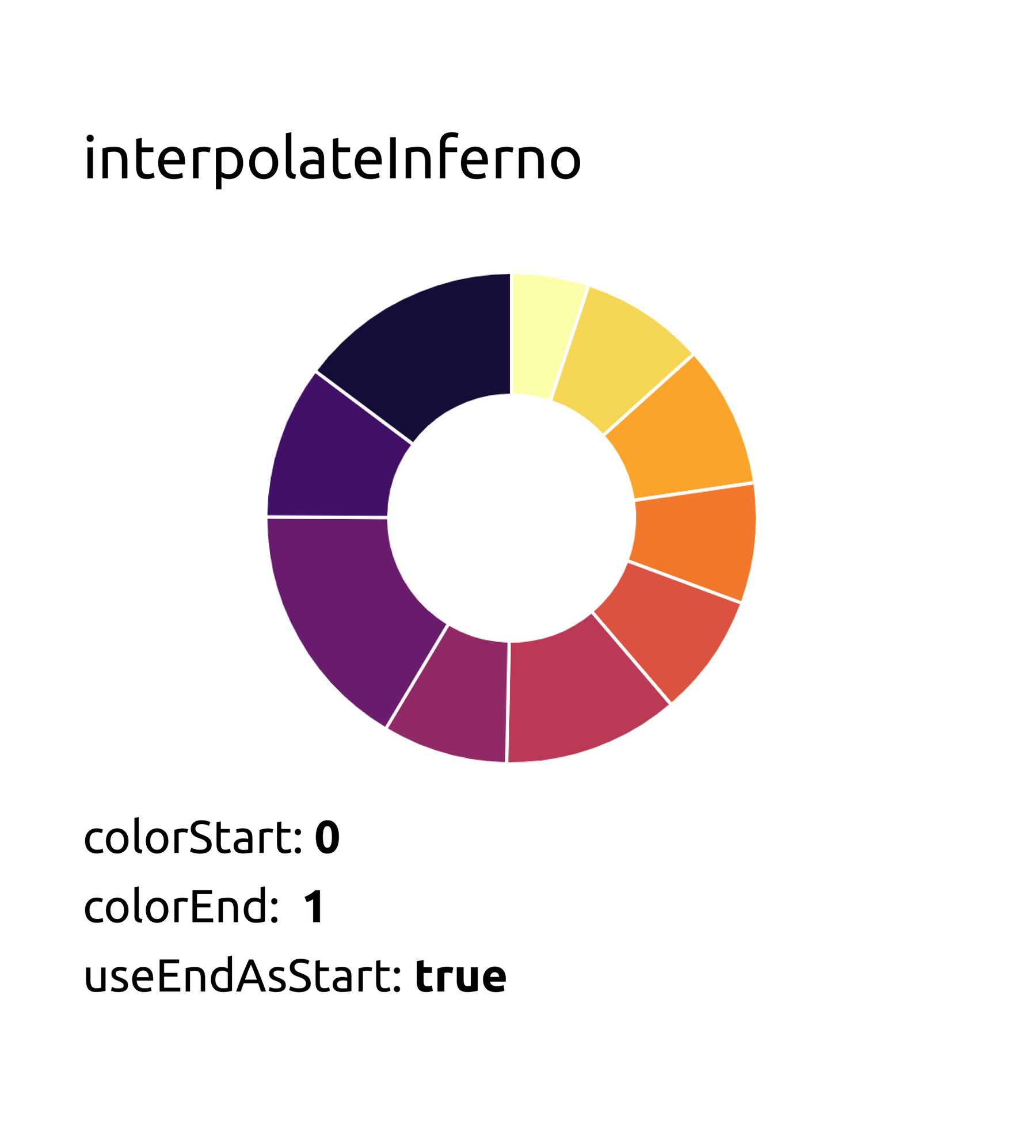 Setting the "useEndAsStart" parameter to true
Various Combinations
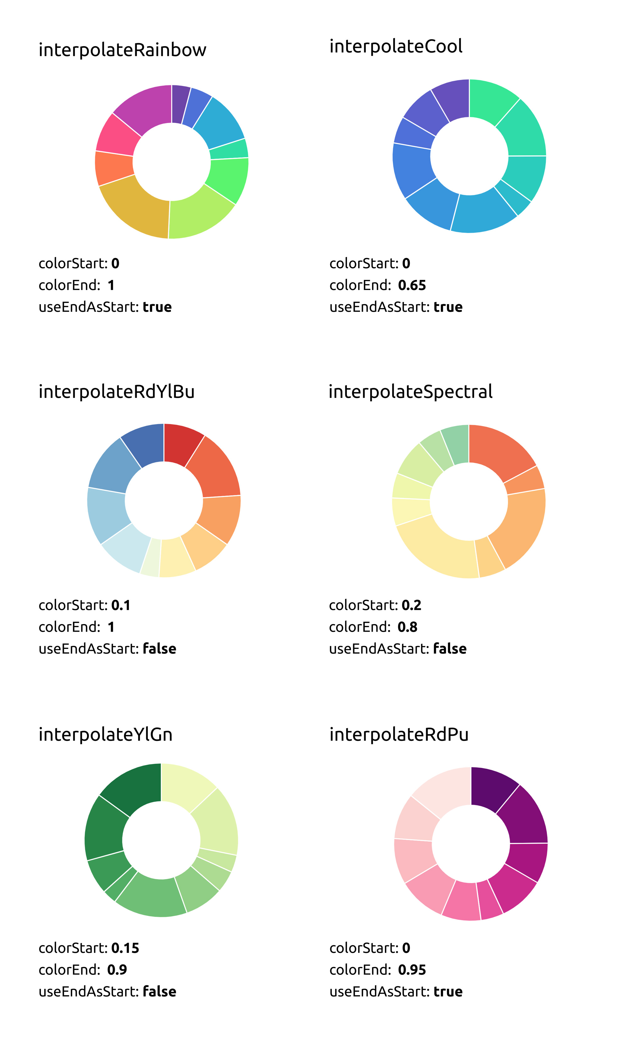
Feel free to check out more interpolate scales from D3 Scale Chromatic's github page.
Thanks for reading!

